Materials & interiors
Quiet Contrast: Styling Decorative Pillows with Natural Texture
A restful room need not be visually empty. The grain of linen, a measured shift in color, and a thoughtful arrangement of shapes can bring a space to life while preserving its calm.
In a quiet room, small details become legible. A shaft of morning light reveals the weave of a cover; a folded blanket makes a shallow ridge across the bed; the edge of a pillow catches a line of shadow. These are modest changes, but they give a pared-back interior its depth. Decorative pillows can do the same. Their purpose is not simply to add color or fill an empty corner. Used with restraint, they introduce texture, proportion, and a gentle point of contrast.
The most compelling arrangements often begin not with a pattern or a bright accent, but with the surface of the fabric itself. Linen has a softly irregular character: small variations in its yarns and weave make the material appear alive without making it busy. Beside smooth upholstery, crisp cotton bedding, or a neatly painted wall, that surface can register like a quiet landscape—subtle at a glance, more interesting the longer it is observed.
This is the art of quiet contrast: a way of creating distinction without disruption. It asks a few simple questions. What feels different beside what is already there? How many shapes does the room need? Where should the eye pause? A successful arrangement need not follow a rigid formula. It does, however, benefit from attention to scale, color, placement, and the daily life of the space.
Begin with the surface, not the pattern
Pattern is an obvious tool for decoration, but it is only one form of visual interest. Texture offers another, often gentler, route. Linen’s characteristic slubs and slight unevenness create a play of light and shade across its surface. The result is not a flat block of color, yet it does not compete with the room as a strong motif might. In a restrained palette, that distinction can be enough.
Consider a linen pillow against a smooth upholstered chair. The chair’s fabric may read as even and continuous; the linen appears more varied, its threads catching light in different ways. Neither needs to be brighter than the other. Their contrast comes from touch made visible. The same principle works on a bed: a textured decorative cover placed against crisp percale or a smooth, closely woven sheet adds dimension without requiring a second pattern.
Texture is also a practical way to make a room feel considered when its colors are deliberately limited. Cream, stone, soft gray, muted green, and weathered blue can share a space without seeming monotonous if they appear in different materials. A matte wall, a fine cotton sheet, a loosely woven linen cover, and a knitted throw each handle light differently. The palette stays composed; the surfaces carry the variation.
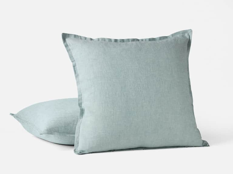
For a natural, relaxed finish, the Organic Relaxed Linen Decorative Pillow Cover offers one example of how texture can do this work. Made from organic linen woven in Portugal from European flax, it has a washed, rippled hand and a 22-inch square shape. Its simple format lets the surface remain the main feature, making it an adaptable accent for a bed or sofa rather than a visual statement that dictates the rest of the room.
Let color make a measured difference
A restrained room does not have to be entirely monochrome. In fact, a small difference in hue can make a quiet palette feel more dimensional. The key is to think of color as a relationship rather than an isolated choice. A muted blue pillow, for example, may feel at home beside warm white bedding because it is softened by the surrounding neutrals. A blue that is very saturated, by contrast, may become the room’s dominant feature.
Begin by noticing the undertones already present. White can lean warm or cool; gray may have a green, blue, or brown cast; beige can appear sandy, pinkish, or almost yellow in different light. A pillow that shares an undertone with the room will usually settle into the composition more naturally than one chosen by color name alone. View swatches or fabrics in the room where they will be used, and observe them in daylight as well as evening light. A color that feels subdued at noon may deepen under a lamp.
Related tones make a naturally calm arrangement. Several shades of cream, for instance, can vary in warmth and depth while remaining visually connected. Soft gray and stone can be joined by a muted blue-gray accent. Olive, flax, and pale sand can suggest a landscape without turning the room into a theme. The distinction between the colors should be visible, but it need not be dramatic.
A single contrast can act as a focal point: a darker pillow among pale ones, an unexpected edge detail, or a subtle motif placed among mostly plain fabrics. Its strength comes partly from scarcity. When every pillow is vying for attention, none can hold it for long. When most of the arrangement is quiet, one distinctive note becomes meaningful without needing to be loud.
Build the arrangement around scale
Pillow dimensions matter because they change how an arrangement occupies space. A broad square gives a bed or sofa a grounded, substantial note. A smaller square can sit in front as a secondary layer. A lumbar shape adds a horizontal line, breaking up the repetition of squares and echoing the width of a headboard, bench, or sofa seat.
Scale is relative. A single large cushion may appear generous on a narrow chair but modest on a long sofa. On a bed, a row of oversized pillows can dominate the headboard, while several smaller forms may look scattered if they lack a visual order. Before choosing covers, consider the furniture’s width and height, the size of its cushions, and how much open space you want to preserve.
A useful starting point is to repeat a shape, then introduce one difference. Two larger squares can provide structure, while a smaller rectangular pillow adds a clear change of proportion. On a sofa, a pair near the ends can frame the seating area, with a third pillow in a related fabric creating a bridge between them. On a bed, a restrained front layer can bring texture forward without obscuring the bedding or making the arrangement difficult to use.
These are starting points, not rules. A single well-proportioned pillow can be more effective than a carefully balanced group if the room is small or already full of visual detail. Conversely, a long bench may benefit from a pair of cushions with a shared color or fabric, spaced to respect the bench’s length. The aim is not symmetry for its own sake; it is a relationship between the pillow and the object that supports it.
Use placement to create rhythm
Placement determines whether decorative pillows feel settled or simply added. On a bed, a familiar arrangement moves from larger pillows at the back toward smaller accents at the front. That progression creates a natural sense of depth. On a sofa, pillows can be placed at the ends to frame the seat, or gathered more loosely to one side when the room benefits from an asymmetrical balance.
Asymmetry works best when there is a reason for it. A group on one end of a sofa may be balanced by a table, lamp, or heavier visual element on the other. A pillow placed off-center on a bed may draw attention toward a bedside table or a folded throw. The room’s other forms—windows, furniture, shelves, and open floor—are part of the arrangement, even if they are not textiles.
Leave enough space for the furniture to remain useful. Pillows that crowd the seat can turn a sofa into a display rather than a place to sit. On a bed, a deep stack may look elaborate but become an unwelcome task at night. A considered arrangement accounts for the way people move through the room: where they sit, where they set something down, and what must be moved aside.
Negative space matters as much as the objects themselves. A pause between pillows lets each shape register. It can also make a room feel less staged. Rather than filling every available corner, leave a stretch of upholstery or bedding uncovered. That uninterrupted area gives the eye somewhere to rest and makes the texture of the fabric more apparent.
Mix materials with a light hand
The simplest way to combine textiles is to give each one a distinct role. Linen might provide an irregular, relaxed surface; cotton percale can bring a smoother, crisper counterpoint; a knitted or quilted textile might add softness and relief. When materials differ in touch and structure, colors can stay close together without the composition becoming dull.
Contrast is most comfortable when it has some common ground. Two fabrics may share a color, a natural fiber character, or a similar level of visual weight. For example, a smooth cotton pillow and a linen pillow in neighboring shades can feel connected despite their different surfaces. A highly glossy fabric, a strong geometric pattern, and a heavily textured linen all at once may produce more competition than the room needs.
Think about finish as well as fiber. A washed linen has a softer, more relaxed appearance than a sharply pressed plain weave. A smooth cotton sateen may reflect light differently from a matte percale. Embroidery, piping, fringe, and contrasting seams each add another line or texture. One small finishing detail can sharpen an arrangement; several competing details can make it feel overworked.
The most successful combinations often have a quiet hierarchy. One fabric leads through its texture or scale; another supports it; a third, if needed, offers a small point of distinction. This hierarchy need not be obvious. It simply keeps every element from asking for equal attention.
Treat linen as a living material
Linen’s appeal is closely tied to its natural character. Made from flax fibers, it can have a crisp or soft hand depending on the yarn, weave, finishing, and use. Its surface often shows gentle variations rather than a perfectly uniform appearance. Over time and with appropriate care, some linen textiles relax and soften, developing a lived-in quality that suits informal interiors.
This change is part of the material’s visual language. A linen cushion need not be pressed into a rigid shape to look intentional. A soft crease or slightly relaxed edge may contribute to the ease of a room, particularly when paired with clean lines elsewhere. The balance lies in allowing the material to look natural while keeping the overall arrangement purposeful.
Care depends on the specific textile, so the maker’s instructions should take precedence over general advice. For the linen cover linked above, the stated care guidance is machine washing in cold water on a gentle cycle with like colors, followed by low-heat tumble drying; a warm iron is optional. Avoid assuming that every linen pillow has identical requirements, especially when it includes embroidery, trim, or a separate insert.
A removable cover also makes it easier to refresh a space without replacing the entire pillow. If covers are changed seasonally, store them clean and dry, and keep their labels or care notes nearby. Small habits like these help preserve the finish and make decorative textiles easier to live with, rather than too precious to use.
A simple method for editing a pillow arrangement
When an arrangement feels uncertain, step back and edit it one decision at a time. Start with the room’s existing materials and colors; do not treat the pillows as a separate palette. Then choose the function of the arrangement. Is it meant to soften a firm chair, bring texture to smooth bedding, or add a small focal point to a quiet sofa?
- Choose a foundation. Identify the main surface—upholstery, bedding, or a bench—and note its color, texture, and scale.
- Introduce one clear contrast. Try a rougher weave against a smoother one, a slightly deeper tone among pale neutrals, or a rectangular shape among squares.
- Limit competing details. If the fabric is strongly textured, keep the pattern and trim simple. If one pillow has a motif, let the others support it.
- Check the proportions. Make sure the cushion size suits the furniture and that the arrangement leaves room for everyday use.
- Remove one element if needed. An arrangement often becomes clearer when the eye has fewer details to negotiate.
Then live with the result. Sit on the sofa, make the bed, and see what gets moved. A composition that looks balanced from across the room but is awkward in daily use has not yet reached a comfortable solution. Styling is not a single fixed event; it is a process of noticing what the room asks for and adjusting accordingly.
Make restraint feel welcoming
Minimalism is sometimes mistaken for a lack of softness. Natural materials can correct that impression. Linen’s irregular weave, a gently rounded cushion, and a restrained shift in tone bring warmth without crowding the room. They keep simplicity from becoming sterile, while preserving the clear lines that make a calm interior feel restful.
The same approach works across different styles. In a contemporary room, linen can soften precise furniture and smooth surfaces. In a more traditional setting, it can provide an unstudied counterpoint to tailored upholstery or detailed woodwork. In a small rental, one or two considered pillows can change the room’s texture without requiring permanent alterations. The material does not need to announce a particular style; it can respond to what is already there.
A useful test is whether each pillow contributes something distinct. One may add texture, another may repeat a color from elsewhere, and a third may alter the arrangement’s shape. If two pillows perform the same role and make the composition feel heavier, one may be unnecessary. The goal is not to reach a prescribed number, but to make each piece earn its place.
That way of thinking also encourages a more durable relationship with household textiles. Rather than continually adding new patterns, choose versatile materials and shades that can move between a sofa, reading chair, and bed. A plain linen cover in a natural or muted color can adapt as other elements change. Its value lies not in being endlessly novel, but in remaining useful through those changes.
The calm of considered detail
Decorative pillows are small objects, but they sit where people pause: against the back of a chair, at the edge of a bed, beneath an arm during a quiet hour. Their effect is both practical and visual. A well-chosen cover can make a smooth surface more inviting, help a room feel complete, and give a restrained palette a sense of depth.
Linen makes that effect especially legible. Its gently uneven surface can contrast with crisp bedding or sleek upholstery without demanding attention. Related tones keep the room connected; a single darker note, distinct shape, or quiet edge detail supplies focus. Thoughtful placement allows the arrangement to support the furniture rather than overwhelm it.
The result is not a room stripped of character, but one in which character emerges gradually. Texture takes the place of excess pattern. A subtle change in hue replaces a loud accent. Space remains between objects, and each material has enough room to be seen. In that balance, decorative pillows become less like ornaments gathered for display and more like part of the room’s everyday landscape: useful, tactile, and quietly expressive.